[Originally published on Sept 29th; updated with version of photo published on Flickr]
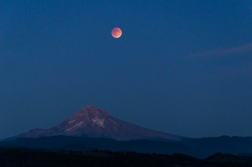
Having invested a lot of time and energy to prepare for and take this shot of Mount Hood from Jonsrud View Point in Sandy, Oregon, I looked forward to checking out all the interesting shots other people were posting. However, two days later I am troubled by what I'm seeing online.
While Photoshop and similar tools are valuable aids in fine-tuning photographs for display, it's easy to bend an image to something that could only have existed in the imagination of the photographer. In some cases, the changes are slight - the image is only slightly different than reality, reflecting a difference in tone, crop, etc. - but in other cases things are morphed beyond the realm of reality.
In full disclosure, I used Photoshop on my tablet to retouch this image and remove a spot that resulted from a dust spec on the sensor of my camera. Note that I haven't yet had time to do other edits, ones only possible once I am home and have access to my PC again such as reducing the noise (edits intended to make the image look more realistic, not less). At a later date, I'll post the edited version.
Other photographers though have not only "cleaned up" their photographs, but they have gone to extreme lengths to transform the images captured in their cameras. In some cases, the moon is shown much larger than it actually was. In other cases, it's positioned differently - it's either lower in the sky, shown in different settings, etc. What they have all done is portray the moon in an very unrealistic manner.
Many would say "that's just a case of poetic license... what's the problem with that?". I don't have an issue with poetic license - it's something I've exercised many times myself. What I do have an issue with though is presenting something of scientific interest, a natural astronomical event, in a way that may be difficult for someone who didn't personally observe the event and may not be familiar enough with similar natural phenomena to discern that what they are seeing is not what they would have seen standing out under the sky last Sunday night.
Note that I'm not talking about the sequence shots that show multiple instances of the moon in a single image (assuming they are proportionately sized and positioned). Those actually tell a useful story of the progression of the event and most people would understand that the image is a composite of multiple shots. To their credit, the photographers for most of the sequence images I've seen, even the ones who materially modify the position and size of the moon in such shots, point out that the image is a composite.
I am not arguing against these images. In fact, I applaud the creativity of the people who produced them - there are several that I'd love to have as the wallpaper on my PC or perhaps even as a print hanging on my wall. For me, what's missing though is transparency about what the image represents, a factual explanation of how it differs from nature. While some people would skim right past a disclaimer that explains the moon image was enlarged to make a more interesting shot, at least all who view such a thing would have the opportunity to understand what they see isn't realistic and why.
Reaction of friends and family when I raised this issue was "good point, but who's going to pay any attention". They may be right but I'm a glass-half-full kind of guy so I'm posting this anyway, hoping that at least a few people pay attention. I'm also a big believer in civil discourse and not a fan of flaming so rather than post comments directly on the images I'm talking about, I'd rather explain the concern here where I'll then share it via social media. If it makes a few people looking at images from Sunday night's lunar eclipse (or other similar natural phenomena) pause and consider whether a given image is realistic or not, great. If this comes to the attention of the photographers responsible for such images, even better. If any of them take the point to heart and update captions to clarify what they changed, fantastic.
If you agree or, more importantly, disagree with me on this, feel free to say so in the comments.


 The journey continues beyond 2009... check it out!

I agree - well said!
ReplyDeleteI was with U and understand the difference now between the real thing and cutting and pasting to create a look. Thanks
ReplyDelete